27

Hi all. I'm Jin, and I'll be working on the designs for the Stack Exchange sites as they graduate from the beta phase. Each site will have its own unique theme that will reflect its topic. However, all sites will share quite a bit of common elements so they feel like they're part of the Stack Exchange family.

I gave the design a lot of thought. There are probably many, many ways to style the final site to make it visually pleasing. To come up with an appropriate design, I reflected on what WordPress and this community are about.

Since its official release in 2003, WordPress has had a tremendous impact on how people publish content online. It has made publishing a lot easier and faster, not just for the tech savvy designers and developers, but the general public, too.

WordPress reminds me of the invention of the rotary print press.
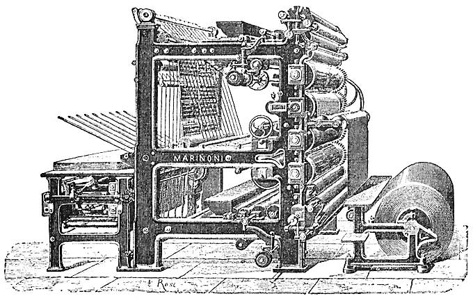
Rotary Press Machine

In the 19th century, the replacement of the hand-operated Gutenberg-style press by steam-powered rotary presses allowed printing on an industrial scale,[11] while Western-style printing was adopted all over the world, becoming practically the sole medium for modern bulk printing.

WordPress was not the first blogging platform, but it was the one that revolutionized the industry, and set a competitive standard for other CMSes out there.

So for the design, I think it's appropriate to go with a timeless and classy look. I think such a design pays homage to the traditional publishing and conveys the authority in the quality of the answers this site provides.

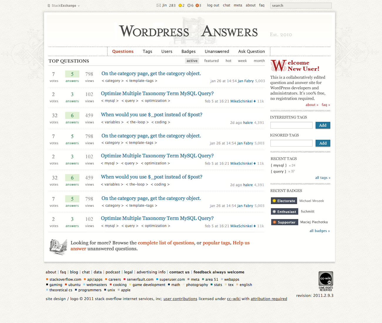
(click on image to see full resolution version)

WP Homepage mockup

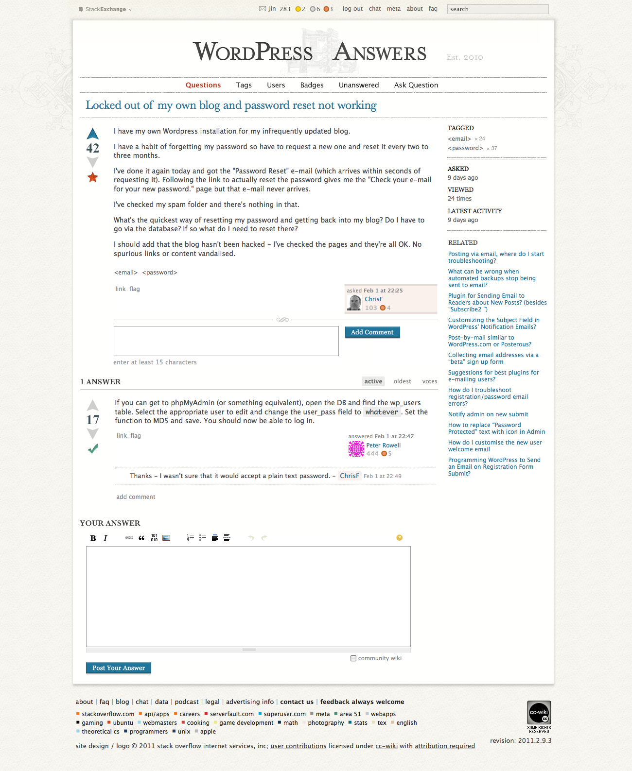
updated: Question view page

WP Question page mockup

Unfortunately, we can't use the officially logo due to copyrights consideration. But I did include some design elements from the official WordPress site. From their design guide page:

WordPress Colors

I've used the same colors for accents, and Mr. Eaves as the typeface in the header logo. The question listing titles are set in Georgia, and the body text are in Lucida Grande. The same typographical styles are used on the official WordPress site.

I believe this design works very well for the goal I was going after. I'd love to hear your feedback.

P.S. An early congrats on your official launch and thank you for providing helpful answers. They have helped so many people out there, myself included.

16
  • woohoo! here we go....
    – nobody
    Commented Feb 9, 2011 at 22:20
  • Is it not likely that you can get copyright permission from WordPress to use their logo in yours? (just wondering)
    – Zack
    Commented Feb 10, 2011 at 1:48
  • 1
    @Zack from wordpressfoundation.org/trademark-policy I do not believe we can use the logo because we're commercial.
    – Jin
    Commented Feb 10, 2011 at 4:02
  • 2
    Somehow I still like the fact that, due to delays on the WP side, we are about to graduate at the same time of the release of WP 3.1 :-)
    – Jan Fabry
    Commented Feb 10, 2011 at 9:06
  • 1
    @Jan Fabry I had tried hard to not blame you for jinxing 3.1, but you are not making it any easier :)
    – Rarst
    Commented Feb 10, 2011 at 9:22
  • @Jin - I'm going to post the two things I don't care for as two separate answers, so people can vote on them separately. Please don't take that as me being twice as critical, though! Overall I quite like it.
    – Travis Northcutt Mod
    Commented Feb 10, 2011 at 14:47
  • @Jin: Do you also have a design for a single question page, or is there nothing special to show there? Other sites sometimes had unique icons for the voting arrows or accepted answer, but maybe you could not find anything fitting for here?
    – Jan Fabry
    Commented Feb 10, 2011 at 15:35
  • 1
    @Jan I posted the homepage first for the over all look and feel. I'll upload a question view page later today. I think you'll find it more "modern."
    – Jin
    Commented Feb 10, 2011 at 19:47
  • 3
    @everyone who just votes here: Leave some comments! it's always the usual suspects we hear, but your voice is important too! If you just read the answers and comments it feels as if EAMann is in the minority with his opinion, but the votes tell otherwise. Leave a comment, to balance out what nitpickers like me are saying! And come back to Meta often, you are part of the community too!
    – Jan Fabry
    Commented Feb 11, 2011 at 8:48
  • +1, superb early industrial press style. I feel so 1888.
    – hakre
    Commented Feb 11, 2011 at 10:57
  • 2
    Can we get a notification on the main site about this question? I believe others sites also had it while discussion their design, to encourage everyone to give their opinion.
    – Jan Fabry
    Commented Feb 11, 2011 at 11:20
  • I wish I could see it in action. "Life and direct", On Site. - Thanks for the new screen. I appreciate all the details you out here and there. - Some little critique: The CC license plate right/down could benefit from some love, the profile of the paper-roll(?) in the ancient picutre can lighten this up?
    – hakre
    Commented Feb 13, 2011 at 1:55
  • The only thing I don't like is the <tag> style, but other than that it's great! Commented Feb 13, 2011 at 11:39
  • Jan, I added a system message. Not showing up yet, but hopefully it will soon.
    – Travis Northcutt Mod
    Commented Feb 14, 2011 at 15:11
  • It's there..... Commented Feb 14, 2011 at 17:07

13 Answers 13

13

Jin,

I think the site design looks simple, clean, and very professional. You've done a fantastic job of balancing the color scheme and fonts. Then again, you're very good at your job, and I would expect nothing less :-)

Considering WordPress is branded as a "Semantic Publishing Platform" in at least the readme, I think the direct analogy to classical print publishing is fantastic. Keep in mind everyone that "publishing" extends to more than just blogs; this doesn't limit us in any way.

Considering also that the site is about a product that uses both <> and {} all over the place (since it's written in PHP), I think the use of those characters is great. It's a subtle reference to the underlying language framework and adds a great technological juxtaposition to the old-school printing press idea. As does the use of guillemets - which are used quite often in WordPress, correctly or not.

Now I want to break the cardinal rule of this StackExchange and ask a question inside my answer. To those of you who are already beginning to bikeshed, please answer the following:

  • Are your problems with the design based on personal preferences, actual design concerns, or real experience with the opinions of WordPress' end users?
  • Would keeping any design elements you don't particularly like in the final design cause problems with the site's users?
  • If things aren't exactly as you want them, will you be able to move forward and keep using the site anyway?

The hardest part about designing a product is remembering that whether or not you like it doesn't actually matter. What matters is whether or not the product (and its design) will meet your intended goals, work with the user's expectations, and solve a tangible problem.

3
  • 2
    Well written, Eric. To answer your questions: my problem with the brackets is a question of personal taste. My problem with overdoing (IMO) the publishing imagery is legitimate concern with user perception. Regardless of what the design ends up being (unless it uses the <blink> tag), I'll be able to move forward and keep using the site ;).
    – Travis Northcutt Mod
    Commented Feb 10, 2011 at 15:21
  • thanks for the feedback. regarding "<>" and "{}" both showing up on the mockup, that was not intended. I missed the sidebar tags. I'm glad you brought up the personal preference point. Let's face it, we all have our own tastes. If I followed my own preference this design would be super bare, but I don't think it'd be an appropriate one. I think the "publishing theme"(not just blogging) suits the site, and gives it a lot of character, to stand out from the many WP sites out there.
    – Jin
    Commented Feb 11, 2011 at 0:51
  • your comment is very well thought. I like it a lot. And it's great to read it as an answer to the design.
    – hakre
    Commented Feb 13, 2011 at 1:37
9

Disclaimer - I suck at design, I am way too nitpicking. Take following as personal ramblings that might or might not have any weight to them at your preference.

I am not big on newspaper aesthetics, but don't particularly mind it either. I expected something more modern, maybe with that grey from palette for more contrast. Anyway with time I spend here I will be blind to new design in half a day, so just initial impression.

One major issue in that mockup for me is large site's name in header.

All other WordPress-related businesses or projects can use the WordPress name and logo to refer to and explain their services, but they cannot use them as part of a product, project, service, domain, or company name and they cannot use them in any way that suggests an affiliation with or endorsement by the WordPress Foundation or the WordPress open source project. For example, a consulting company can describe its business as “123 Web Services, offering WordPress consulting for small businesses,” but cannot call its business “The WordPress Consulting Company.” Similarly, a business related to WordPress themes can describe itself as “XYZ Themes, the world’s best WordPress themes,” but cannot call itself “The WordPress Theme Portal.”

So I'd very much like if we had another shot of evaluating site's name (even if domain stays same) for release.

  • Third, that font doesn't quite work in plain non-bold logo-less version. Both WordPress.org and WordPress.com headers have logo next to it, as well as play with colors and gradients to make it work. Just typed out it is boring and "Answers" in same style dilutes it further (did I mention "Answers" part also sucks? :)

I think that W in "Welcome New User" in orange and with ornament looks waaaay more interesting and pleasant, that same W grey and blunt in "WordPress Answers".

Minor issues so far:

  • "ask question" needs to be emphasized;
  • tags are inconsistently enclosed in < > near questions, but in { } in sidebar;
  • as an idea - some sites have more customized badges than the others, maybe colored W instead of abstract circle? It will add bit of meaning to it, for example instead of "colored blob Supporter" badge will read "W Supporter".
8
  • 1
    I also agree on the "WordPress Answers" name: it was just an idea on Area 51, I don't think it got much discussion there?
    – Jan Fabry
    Commented Feb 10, 2011 at 9:23
  • 1
    +1 for <> vs {}.
    – user66
    Commented Feb 10, 2011 at 10:48
  • About the badges: I was thinking of other symbols that come back often in WordPress development, and then we of course have the dollar sign to start variable names. But that would probably be too confusing: we're not handing out money here.
    – Jan Fabry
    Commented Feb 10, 2011 at 15:25
  • 2
    Agree about the name. It's very clumsy to work with. I quite like "WP_Query" as a name...
    – MikeSchinkel Mod
    Commented Feb 10, 2011 at 16:54
  • @Rarst, re: trademark: Jeff Atwood has asked Matt Mullenweg about the "WordPress" on this site and he was OK with it. That's why we've been using it on the Beta site. Also on the main site footer we have additional text to indicate we're not associated with WordPress Foundation.
    – Jin
    Commented Feb 11, 2011 at 1:02
  • @Jin I remember he posted about his conversations with Matt but I don't remember any specifics about using WordPress in name mentioned. Well, if it's covered... "Answers" part still sucks thou.
    – Rarst
    Commented Feb 11, 2011 at 8:51
  • I missed the discussion on why queryposts.com couldn't be used for a name, and I don't see any explanation on the other thread linked. Where is the discussion for that? Commented Feb 11, 2011 at 21:05
  • @goldenapples basically it was scrapped not as specific name for our site, but as whole idea of custom domains/names for new SE network sites. Custom domain/name was tested on Web Applications, considered failure and reverted.
    – Rarst
    Commented Feb 11, 2011 at 21:14
9

I think the connection to publishing is overdone, especially with the printing press watermarked in the header. As Jan mentioned, WordPress is currently moving (whether intentionally or not) away from being seen as just a blogging platform. I think the people active on this site, especially the "experts" - those who bring a great deal of knowledge to the site - are part of that movement (i.e. developers using WordPress to build all sorts of sites, as opposed to individual bloggers).

I too would like to see some more modern influences, and the removal of the overly publishing/blogging related elements.

4
  • +1 - Completely agree.
    – MikeSchinkel Mod
    Commented Feb 10, 2011 at 16:56
  • 2
    Thanks for the feedback! I wholeheartedly agree that Wordpress today is more than just a blogging platform. However, I don't see how you got the impression that this design is reflecting "blogging" only? It's meant to have a "publishing" theme, as in publishing in general.
    – Jin
    Commented Feb 10, 2011 at 19:33
  • That makes sense. I think some of us around here have a sensitivity to anything that might be construed as blogging related imagery/design. Even though web publishing in general doesn't mean blogging, the old-fashioned imagery (printing press) evokes more thoughts/feelings about writing/books, which (to me) is more along the lines of blogging than just web publishing in general. I/we may be hypersensitive to that, but for good reason - a lot of the participants on this site are eager to continue moving WP towards being accepted as a fully fledged CMS, rather than a blogging platform.
    – Travis Northcutt Mod
    Commented Feb 14, 2011 at 15:06
  • As i wrote in a later answer: I completely agree. I really appreciate Jin's effort to make this more personal, but to me it's much too old-fashioned. Should imho be more minimal & modern. This is not a "type writers club" ;)
    – kaiser
    Commented Feb 14, 2011 at 22:01
6

I really like the colors and the use of space. Can't wait to see it live! :)

Some suggestions:

  1. The left and the right borders of the main navigation (Questions … Ask Question) seem to be unnecessary.
  2. The drop shadows just don’t fit in. Especially the search buttons look like aliens from another site.
  3. Please do not use Lucida Grande or Tahoma for the final site. Both do not have a native cursive style, so font-style:italic will look really, really bad. I have set up a test case for a reduced demonstration.
  4. At the end of the »Welcome New User« box are two links, »About« and »faq« followed by an quotation mark (guillemet). I guess, these are meant to be arrows. May I ask for real arrows?
5
  • 1
    I agree on most points. Maybe not the guillemets: They are (ab)used like this a lot in WordPress, and I don't know whether that would be a recognizable extension of it, or a further confusion of our European and Asian friends who use it in their daily language.
    – Jan Fabry
    Commented Feb 10, 2011 at 9:10
  • thx. re: 2) The drop shadow of the main content area is for the faux paper effect. The top bar(link, search box) are intentionally decorated as "meta" content that's why they look differently. 3) While I'm aware of this, but I don't see it being a huge issue. the Official WP forum uses Lucida Grande too. I've looked at a lot of the users generated content on WP.SE so far, the italic use case is rather rare. 4) "»" is actually part of the global SE htmls which I cannot change.
    – Jin
    Commented Feb 11, 2011 at 1:11
  • what glyph do you recommend instead of &raquo; ? Commented Feb 11, 2011 at 1:39
  • @Jin 2) Sorry for the confusion. The »Add« buttons don’t look right, the search bar doesn’t even have a button (which is okay). 3) I read your reference to the rotary print press as a reference to good typography too – something I miss on wp.org. Georgia for example looks beautiful on english.SE – and maybe here too?
    – fuxia Mod
    Commented Feb 11, 2011 at 2:46
  • 1
    @Jeff Atwood Hm … ⇨ or ↦ maybe. There are some right arrows in the Unicode Block Dingbats too, ➤ or ➜ for example.
    – fuxia Mod
    Commented Feb 11, 2011 at 2:51
3

I have some mixed feelings. Yes, you have the idea of authority with the "old fashioned" and "classic" layout, but isn't it also too much "WordPress the blogging platform", while we also try to focus on the more advanced CMS possibilities? We already touched on that while discussing the tagline. We (or at least I) really like advanced solutions to advanced problems, and I somehow don't feel that idea of being "cutting edge" in this design.

Personally I really like the design of WPEngineer, but this is probably too close to the current sketchy theme to be taken as a starting point?

5
  • Yes, "advanced" is a good word. Newspaper looks can easily look great, but they rarely give me "hey, this is powerful and interesting" vibe that WordPress does posses.
    – Rarst
    Commented Feb 10, 2011 at 15:43
  • I concur; most of the people on WordPress answers are trying to build websites, not just be bloggers.
    – MikeSchinkel Mod
    Commented Feb 10, 2011 at 16:52
  • 3
    Thanks for the feedback. The focus is on professional and publishing. The look isn't limited to just "blogging," but publishing in general. I looked at a lot of WP related sites out there, WPEngineer included. My goal is to give this community a distinct identity to stand out from the rest.
    – Jin
    Commented Feb 10, 2011 at 19:08
  • Hmm, you can't downvote your own post? Part of the reason I wrote this is because there was no "negative" answer yet, and I was afraid nobody would dare to say something. So it was a sort of "devil's advocate" thing. Notice the weasel words with which I started... Distinctive is good! And the high quality should come from our answers, not (only) from the design.
    – Jan Fabry
    Commented Feb 11, 2011 at 8:59
  • I certainly don't want praises only. Being devil's advocate is good! 100% agree that the quality of the site relies on the quality of Q&A. The design, however appropriate and visually pleasing, has a very fast diminishing return.
    – Jin
    Commented Feb 11, 2011 at 21:19
3

I do not care for enclosing the tag names in greater-than and less-than symbols/brackets. I think that's too similar to html tags, and I don't think that 'works' on this site.

3
  • I'm torn on this. On the one hand I like the connection with HTML editing, on the other hand I think the current spacing is a bit odd. < template-tags > vs. <template-tags>? Or maybe just go back to [template-tags]?
    – Jan Fabry
    Commented Feb 10, 2011 at 15:33
  • @jan I have no preference on the spacing. I certainly can tighten it. @tnorthcutt As for "< >" vs "{ }" vs "[ ]" I chose "< >" because of the HTML connection.
    – Jin
    Commented Feb 10, 2011 at 19:14
  • Personally I don't see enough highlighting of the tags. I think they go unnoticed, and in most other SE sites, they have a special design. Can't they have a background image of some kind to make them more visible? Commented Feb 14, 2011 at 13:19
3

I'm not sold on the logo. There is no need for it to be so big.

It moves more content below the fold, without reason. Moving the perfectly functional navigation elements to a different location below the massive logo area is both disorienting and adds zero benefit other than "white space", which isn't essential for that particular purpose. White space is good, functionality + white space is better.

Also, the mixed small caps + large caps creates a visual "weight" issue, given that the W-P and A appear much heavier, thicker, than the small caps. True small caps are supposed to match the weight of the full caps.

I'd suggest all small caps, which removes any weight issues, and prevents me from staring at MullenWeg's Folly every time I look at the camel-cased WordPress. Then move the nav back up to the top where it's more useful.

Example

4
  • the design goal was to make the over all site feel press like. That's why the big heading and center aligned navs. As for the capitalization, WordPress is the official spelling. The white space on top is to create an airy feeling. The header section is only 30px taller than the Beta theme.
    – Jin
    Commented Feb 14, 2011 at 19:37
  • Capitalization does not equate to spelling. As to the "press like" feeling, I understand the sentiment perfectly, and I think that it IS pretty. But understand, I was a newspaper designer for a long time, and there was a specific reason why newsprint started going away from that about 100 years ago. Function trumps form in newspaper design, always.
    – Dan Gayle
    Commented Feb 14, 2011 at 19:48
  • thanks. What functionality is lost here? the header is 30px taller, that's 1/3 of a question listing less than before. People do scroll, fold is a myth. bit.ly/3Y3PKC I can understand the header layout is different from the Beta theme, so it may take a bit to get used to. In my experience with other SE sites, very few people had problem with new layouts, unless it's a personal preference issue.
    – Jin
    Commented Feb 14, 2011 at 20:06
  • @Jin - People do scroll, but not always. The move content in the first screen generally the better. Like some, I'm not a fan of the large logo.
    – MikeSchinkel Mod
    Commented Feb 14, 2011 at 23:40
2

I'm sure jin worked hard on this design, but I'm afraid I'm one of those who preferred the original design. I'm an old-school engineer, and any aspect of design that detracts from readability and usability is, IMNSHO, a loss.

Rather than just saying, "let's go back," let me get specific:

  1. I find the text in the new design fundamentally harder to read. After admiring the design for about the first .5 seconds, readability is everything to me. This site (and all of the related Q&A sites) are all about text, text, and more text. If the site is hard on the eyes ... I'm gone.
  2. The highlighted areas (number of answers, etc.) don't draw the eye. They look pale and washed out to me. I find myself working harder to find things on the page when it should have been a simple scan of the eye.
  3. I don't like big headers. They are a waste of real estate -- above-the-fold or otherwise.
  4. The angle brackets around the tags just don't work for me. I'm not too wild about the { }, either. These aren't HTML tags, they are concept tags in a Q&A site. I shouldn't have to think for an instant about what I'm looking at.
  5. The one thing I find easier to use in the new design is the "Post Your Answer" button. It stands out much more clearly than in the SO design, where it almost looks like a decorative box of some sort. Here, by God, it's a button. In fact, it's about the strongest visual element in the whole design.

Speaking for myself, I will take clunky-but-usable over elegant-but-tiring-to-use every time.

Assuming that the current look has been anointed as the design, is there any chance of getting an alternate design? I don't know the implementation specifics, but I'm assuming it would be a simple matter of having a preference and a different stylesheet. Hell, I'm even willing to take a copy of the original stylesheet and set up FF (maybe using GreaseMonkey) to substitue it on WPSE. Yes, I feel that strongly about it.

Update: Seek and ye shall find. I've just discovered the Stylish plugin for FF. Basically, it does for styles what GM does for scripts. In other words, it appears to do exactly what I want. If I could get a copy of the old stylesheet CSS I'll be fine and just go away.

5
  • +1 for "washed out". Plus it now looks like tags are code chunks. Hard to separate from the comments below the question. same goes for the header. And yes, the button now stands out. I like that ... but it seems to be the only benefit so far.
    – kaiser
    Commented Feb 15, 2011 at 11:28
  • you can grab the Beta theme CSS file from any of the existing Beta sites. for example: sstatic.net/guitars/all.css
    – Jin
    Commented Feb 15, 2011 at 16:40
  • @jin: Thanks a lot! Commented Feb 15, 2011 at 19:01
  • np. keep in mind though, once a Beta site graduates, its css content will change. So when that happens, grab a css from another Beta site. You can see all the Beta sites here(The ones with "Sketchy" logos): stackexchange.com/sites?sort=newest
    – Jin
    Commented Feb 15, 2011 at 19:08
  • 1
    @jin: Thanks, I genuinely appreciate the pointers. I hope you took my criticism as aimed at the design and not the designer. For a non-designer I can get pretty exercised about some of these things. I've been ranting about bad computer-based typography ever since I worked at Xerox in the late 70's. :-) Commented Feb 15, 2011 at 22:33
1

Although the rotary printing press represents a 200 year old technology, I think it's the best visual association one could make.

However, the little image with books in the lower left corner (where it says "Looking for more?..." etc.) is superfluous. Just leave it without an image, like on SO.

Oh, and make the logo bigger! </joke>

1
1

Thanks for putting this together Jin, I really like that.

As far as for an industrial-type, centralized, straight logo, I came up with this in a quick draw:

enter image description here

It's far away from being perfect, I don't have the typeface here and needed to cut that out from your png.

Looks like stemming something up.

Update: The visual line in the header typography was a bit disquietingly, probably obviously that it was me who tried to do this (but read carefully it's still with capital P):

enter image description here

How do the flashers on top look like (new badge etc.)? You already have something for those? Just curious.

7
  • @hakre: I have to downvote this for both suggestions: I don't like the "WordPress Answers" name and thus not the "W-A" combination, and I think we should stick to the traditional, trademarked "WordPress" spelling.
    – Jan Fabry
    Commented Feb 11, 2011 at 11:09
  • @hakre, as for the notification banner, it'd be a solid colored banner.
    – Jin
    Commented Feb 11, 2011 at 21:38
  • @Jin, I really like your style. Probably that would be over-styled, but is there something like a "featured question" which could be placed in a central "headline of the day" newspaper style on the homepage? Just an idea, it's probably too bold but would kinda stylish pick-up the newspaper theme. - and it could make the featured question more prominent as we don't have them that often (for now, probably that will change in the future).
    – hakre
    Commented Feb 12, 2011 at 10:31
  • @hakre the notification bar having a dark bgcolor is one of those SE wide conventions. the idea to to draw attention. As for a featured question, this may be hard to implement, and also harder to maintain. I've done a "featured photo" on photo.se. It basically uses system message box where the moderators have to manually update every 48 hours. It's a lot of work.
    – Jin
    Commented Feb 12, 2011 at 18:02
  • @Jin: As a webmistress I can totally understand what you're talking about and to be honest, next to all that, there will be enough "work to do" for moderation. So please don't follow any thoughts regarding that idea any longer. Current "highlight" options are actually working graphically well enough. - Side-Question: Did you made this great beta-design?
    – hakre
    Commented Feb 13, 2011 at 1:44
  • @Hakre Yes, I designed and did CSS implementation of all the SE related sites except for the original Stack Overflow trilogy. It's been a challenge for sure. Even though each site is basically a "skin" of Stackoverflow, but each site is unique and attracts different type of audiences. I'm in the process of a writing a blog entry on my recent work experience, should be a fun read. If you're interested, here's a blog I wrote about designing Area51: 8164.org/designing-area51
    – Jin
    Commented Feb 13, 2011 at 2:05
  • @hakre Trilogy: Stackoverflow.com Serverfault.com Superuser.com
    – Jin
    Commented Feb 13, 2011 at 2:28
1

My 2c - for what it's worth (I contributed to some early badges for WordPress waaay back in 2003/4).

The rotary printing press approach is relevant to those who don't know the history of WordPress - but I'm always reminded of the "other" blogging CMS - MoveableType as the original "printing press".

Regardless, when you use a serif font, you think printing, press, etc, and I really like the palette and accents you've incorporated.

1
  • This was also an initial concern of me. Because I'm not a native English speaker I once looked up the meaning of "Movable Type", and since then, when I see a printing press in the context of blogging, I think of them. But that is not the case for everybody of course.
    – Jan Fabry
    Commented Feb 13, 2011 at 14:47
1

@font: A serif type face is imho for reading large amounts of text and i don't think that it would fit the 1/4 explanation 3/4 code that most threads got. Switching from courier to times is too close in my eye, so i'd favor arial/helvetica + courier and design that steps back.

I personally would prefer something clean & simple (nice reference: http://www.minimalsites.com/), because it's focused on the content and questions and answers.

Just a question: Why not leave the current design? It's nice even if it doesn't fit the context 100%.

7
  • @kaiser the body text will be in sans serif. Serif is used for header text only. The current design is for Beta sites only. All SE Beta sites use the same design.
    – Jin
    Commented Feb 14, 2011 at 17:25
  • didn't know that i can click, load and zoom in until now. haha! but i still got the opinion that it should be as reduced and modern as possible. (see reference link)
    – kaiser
    Commented Feb 14, 2011 at 17:26
  • @kaiser I'm a fan of minimalism. However most of those elegant minimalist sites are balanced by vibrant imageries, which we don't have on this site. That's why I'm leaving the content area clean, just decorated the header.
    – Jin
    Commented Feb 14, 2011 at 17:57
  • 2
    I don't agree with any of the arguments except the last. I like the current design.
    – Dan Gayle
    Commented Feb 14, 2011 at 18:04
  • ehm... what happend now? Is this a test, or has the design already been accepted? Just from reading through the comments i'd have said that 2/3 don't relly enjoy the ... proposal(?). Can't we just have something modern?
    – kaiser
    Commented Feb 14, 2011 at 22:05
  • 1
    @kaiser - +1 Agree with your comments.
    – MikeSchinkel Mod
    Commented Feb 15, 2011 at 1:56
  • @Mike: thanks @Jin: what i absolutely appreciate is the smaller font size for the pre/code parts. What makes me headaches are the <tags>, that were much more tag-looking before.
    – kaiser
    Commented Feb 15, 2011 at 11:24
1

Just to add to the discussion, I agree with lots of things which have been said, so I'm just listing them to be clear:

  • I think the "publishing theme"(not just blogging) suits the site
  • One major issue in that mockup for me is large site's name in header - I think it's lacking some "personality" to differentiate it from other SE sites.
  • I think that W in "Welcome New User" in orange and with ornament looks waaaay more interesting and pleasant, that same W grey and blunt in "WordPress Answers"
  • "ask question" needs to be emphasized;
  • The drop shadow of the main content area is for the faux paper effect « This looks awesome.
  • I do not care for enclosing the tag names in greater-than and less-than symbols/brackets. I think that's too similar to html tags, and I don't think that 'works' on this site - As I commented: I don't see enough highlighting of the tags. I think they go unnoticed, and in most other SE sites, they have a special design. Can't they have a background image of some kind to make them more visible?

To answer EAMann:

  • Are your problems with the design based on personal preferences, actual design concerns, or real experience with the opinions of WordPress' end users?

Just my opinion. It's how I perceive the design.

  • Would keeping any design elements you don't particularly like in the final design cause problems with the site's users?

Maybe, I don't know.

  • If things aren't exactly as you want them, will you be able to move forward and keep using the site anyway?

Well, if I only used things that are exactly as I want them, that would limit all my web traffic to my personal blog and website... Of course I would still use the site, the SE pattern has already been established, and other than some design differences, it would be ridiculous to think if the design isn't exactly as I want it, I wouldn't use the site.

In general, I perceive there are not enough elements to "recognize" the WordPress Answers site immediately. It looks too "generic" to me, too similar to the default Stack Exchange design. When I read about the rotary print press and saw the image, I expected much more, with more personality. I liked how it looks like all "press" like though.

The Gaming and Cooking sites for example, are two that have a design with much more personality. So, I think by looking at the image, I can't relate the site to WordPress instantly, and I can't completely differentiate it from other SE sites that much.

In general it's a great design, so don't get me wrong, but I feel like it could have more personality yet.

5
  • thanks for the comprehensive write-up. what elements would make you to relate to WordPress immediately? WP by itself is rather generic. Most WP sites out there look similar. In fact, I feel this press look makes our site stand out from the rest. As for comparing it to other SE sites, I think the visual execution has to achieve the said design goal. That goal was to make it press like. Gaming and Cooking designs were meant to appeal to a wider public, where as WP audience is narrower. As for tag treatment goes, when I added a darker bg, it made the site look very busy. But I'll try…
    – Jin
    Commented Feb 14, 2011 at 19:31
  • … a lighter shade. As for "< >" treatment, I don't have too strong of a preference. However I'm open for suggestions. I feel "< >" does work considering a lot of WP codes involve HTML.
    – Jin
    Commented Feb 14, 2011 at 19:32
  • Well, I don't want to say the WordPress logo... but what about something similar? Something like the W in "Welcome", that tells me "Hey, this is the WordPress Answers site". Anyway, the more I look at it, the more it grows into me, and I'm starting to like it better everytime I look :P Don't get me wrong, I really like the whole concept of the theme, but in general I find there's something missing. I think the tag issue would finally convince me on the general UI. I don't know if using "<>" is the issue, more as I said, I think they go unnoticed. Probably a light color bg would make it. Commented Feb 14, 2011 at 21:24
  • And please, do take this comments from a developer who knows nothing about design other than working with designers and usability people, but not someone who has studied all of this. So all of these comments are just based on my opinions :) Commented Feb 14, 2011 at 21:26
  • Wait, what? I just updated the site, and get the new design! :P Commented Feb 14, 2011 at 21:33

You must log in to answer this question.

Not the answer you're looking for? Browse other questions tagged .