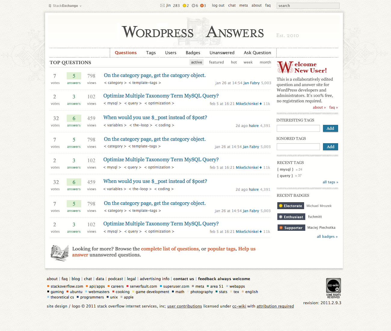
Thanks for putting this together Jin, I really like that.
As far as for an industrial-type, centralized, straight logo, I came up with this in a quick draw:

It's far away from being perfect, I don't have the typeface here and needed to cut that out from your png.
Looks like stemming something up.
Update: The visual line in the header typography was a bit disquietingly, probably obviously that isit was me who tried to do this (but read carefully it's still with capital P):
How do the flashers on top look like (new badge etc.)? You already have something for those? Just curious.

