-10

I'm addressing concerns here: Fixing the new design


EDIT: I realize many of you have concerns about the change in logo and color scheme; I had good reason to adjust both of these, but did my best to incorporate your feedback. If you're willing, I'm happy to meet next week and chat about this - maybe you can help me come to a better understanding of where this falls short.


You may have noticed some updates to the design lately, they are part of a SE network-wide update to a new base css framework.

The updates allow us to:

  • Have sharper / more beautiful design on retina displays
  • Fix layout bugs
  • More easily add new features to all of our sites in the future

But more importantly, it gives you access to the new profile!

If you see any bugs please let us know in the form of answers (to this post) that illustrate one particular thing at a time.

Thanks!

5
  • 4
    Define "meet"? This is what meta site is for kind of and I requested a new thread for proper discussion on design specific in a previous Q.
    – Rarst Mod
    Commented Nov 6, 2015 at 17:48
  • 11
    -1 Honestly, I don't think this new blue interface echoes the design of wordpress.org and only seems to gimmick wordpress.com -- why? This is a Q&A for WordPress development (.org) not the blog host (.com) so it all may appear confusing than anything else. It's already confusing for new WordPress users, mixing .org/.com so I think this design should help to differentiate rather than add to the confusion if you get my drift.
    – Christine Cooper Mod
    Commented Nov 6, 2015 at 17:48
  • 2
    I do however love the favicon, the grey one on this meta site, not the blue one :)
    – Christine Cooper Mod
    Commented Nov 6, 2015 at 17:55
  • 4
    @StéphaneMartin Let's create another meta topic and actually discuss some design changes - it seems like a lot of people feel their suggestions are getting ignored. As far as I can tell the only suggestion brought over was the uppercase "P" in WordPress. One of the biggest issues I can tell is the blue. I see good feedback regarding the body font and mixed feedback regarding the logo but from my understanding we your company won't let you use anything close to the WordPress official logo. Hopefully through that we can find a compromise, thanks for your help / work on this!
    – Howdy_McGee Mod
    Commented Nov 6, 2015 at 18:39
  • If the "P" in the logo would actually look like a P and not a u-turned "U"…
    – kaiser Mod
    Commented Nov 7, 2015 at 1:22

5 Answers 5

22

I am extremely disappointed that:

  • that feedback was largely ignored
  • that request to open new and properly visible thread for design discussion was ignored
  • that it wasn't made clear that decision is made and no further discussion will happen (everything I thought through for it went down the drain)
  • that this is exact repeat of situation with first design, with feedback being asked for and ignored

Stack Exchange puts “It's built and run by you” up high, but apparently design considerations are above that.

2
  • In my opinion, the tone of your last line here undermines your more constructive concerns. I didn't want to edit it if you think it's needed, but thought it was worth sharing that it may be undercutting your other notes for some. Just my 2c.
    – Jaydles StaffMod
    Commented Nov 6, 2015 at 21:10
  • 6
    @Jaydles I understand that that line cuts sharp, but I have no mild way to put how much dissonance I felt twice about handling of design for our stack in contrast with my usual experience with Stack Exchange processes. I would feel better if it was handled as something up to admins overall, rather than being dangled as something our opinion matters on... then being implemented like it doesn't at all.
    – Rarst Mod
    Commented Nov 6, 2015 at 21:26
19

Design and branding for the WordPress niche

This discussion keeps dodging having the one clear thread for specific discussion of WPSE design.

While the current Q only asks for "bug reports" and this isn't one... I don't have a better place, so here it goes. This is something I wanted to be read before new design was launched. Or even better — before it was started on. But better late than never.

While I am not designer by trade, I had been on same precise task of making site for WordPress niche. I had also been involved with development of newer part of WordPress.org site and heavy design challenges of that.

The kinds of “WordPress” design

There are many facets to what can be considered and/or taken as an inspiration for WordPress–like design. Just after brief pondering I could name this many.

dot org

wordpress.org http://s.wordpress.com/mshots/v1/http://wordpress.org?w=600

WordPress.org site has been the web presence of WordPress project for a long time. It design stayed mostly same for a number of years, but had aged well and stayed mostly intact.

The biggest challenge with it is that its initial purpose grossly limits veering of into a new directions. It was envisioned as content site first and has enormous challenges moving in more specialized directions, such as new code reference.

dot com

wordpress.com http://s.wordpress.com/mshots/v1/http://wordpress.com?w=600

WordPress.com site is like an evil ;) twin the web face of WordPress.com blogging network. Since the official split dot com had always been different enough to claim separation, yet similar enough to benefit from shared branding and fame.

I hadn't been following it closely, but I think in recent few years its characteristic design features had been blue color theme and the custom spin on WordPress admin side.

admin

Of course there is the WordPress software core's admin interface itself. It tends to move at a faster design pace, but I would say the each look is relevant for 2-3 years maybe.

Then of course it is admin design and re-purposing it for front end site isn't commonly (if at all) done.

core themes

2016 theme

Since 2010 each year there is a new native theme shipping with WordPress core. The approach had been introduced to diversify a bit and for themes to be able to go in a more diverging directions, than just blogging.

Some are better accepted than others. With qualified tweaking they can make recognizable, but deeply individual sites.

Though the relatively short annual cycle prevents from any one of them getting associated with staple WordPress look.

theme trends

And of course there is a vibrant and giant ecosystem of third party WordPress themes.

In my personal opinion despite the wide field and amount of niches, in general the WordPress software architecture itself and official repository requirements had contributed to what I call "WordPress look" that follows overly common of columns-sidebar(s) formula.

It is quite common from WordPress sites to dog food. Some of the most high profile meta-projects use off-the-shelf themes (again - usually with qualified tweaking).

The challenges of “WordPress” branding

In the branding space the diverse facets are much less of an issue. The WP niche had long suffered from a streak of Word*, *Press, and WordPress-something projects.

If you take a look at word cloud of plugin names from official repository, even there the complete redundancy of WP/WordPress is dominant.

In the space where connection with mainline WordPress project and its values is extremely important it can be a challenge to find a strong self-sufficient identity.

Some had never tried, some gave up, and some are coming to that after a years long spans of time.

How and why new design got it horribly wrong

In a nutshell my impression of the new design is that it is a WordPress com ripoff with a bad logo.

the colors

When doing such a meta design there is strong lure in using the native WP colors. I think this technique must be used carefully and that colors are not design. Myself I prefer to use them as accent colors and trivia of source — there for those who recognize the nod.

The new header's precisely follows the color of WordPress com, not even org. It is also minimal to a point of bland, especially in perspective of my experience with other sites of SE network.

the logo

new logo http://cdn.sstatic.net/wordpress/img/[email protected]?v=e6d1dc9106b5

This might be subjective, but from this logo I get a strong feel of those horror stories about sites that do extremely cheap and abundant logo designs.

Why is it in a circle? Why is it in this font? Why is is merely “WP” and how does this represent us at all?

The history of WPSE identity

The story of our branding and identity is somewhat a rocky one.

Beta and out

Our stack had been boilerplated as WordPress Answers in beta and this kept on into release. There has been concerns about similarities with other sites in WordPress space and generic nature of it, not serving our scope well.

Anyway the name stuck for a long time and led the site being more commonly known and referred to as WPSE after common "[name] S[tack]E[xchange]" formula. Note the solid WPSE spelling, not WP SE and not WP.SE

The name that wasn't

At the time there were network plans to give site unique names and domains. Alas the program fizzled before it got to us and our preferred name of Query Posts went on to have a very different life.

The first design
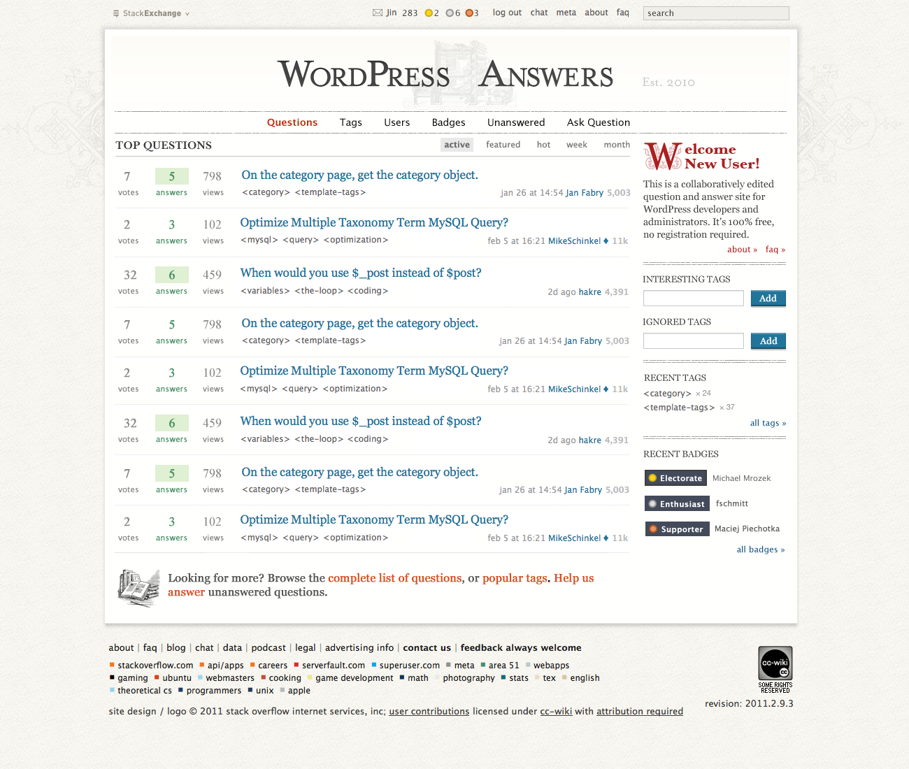
first design

Our first custom design was done and launched, suffering much the same issues with ignoring the feedback and questionable fit.

It was done in aesthetics of printing press and retro typography. In other words none meaningful connection to WordPress niche, other than word play, and history of grievances with readability.

Rename to Development

After years of complaining, lobbying, and roller coaster of exchanges with administration we had finally managed to get renamed into WordPress Development. This has much clarified our branding and helped our scope.

Though in day-to-day the WPSE designation pretty much renamed, WordPress Development hadn't gone on to spawn a new abbreviation.

The direction I'd like to see

While primarily I am expert and active contributor at WPSE, I am also big believer in SE formula and reader of other stacks. When I have a question in an unfamiliar niche the first thing I would check if there is a stack for it.

Over the years I had been somewhat... bitter and feeling like we got the short end of the design stick, comparing to the other stacks. There are quite a few of them that I consider beautifully designed. Not just fancy looking, but functioning and upholding the spirit and aesthetics of the whole network.

I don't know how the process works internally. I have a hunch that WordPress is hardly and exciting topic to design for. More so for people who are not actually involved with it.

We aren't the one of network's darlings either, with our visibility contained to our own niche, rather than generically shining for the whole internet.

Yet... I feel pigeonholing us in a shallow mediocre design is unfair to our site's community.

We aren't just visiting here. We are dedicated and hard working part of Stack Exchange network, proud to be in it. Our identity is much stronger influenced by SE principles and goals, than those of WordPress project.

That's the kind design I would like to see for use — design of a Stack Exchange site, shining brightly among equals.

4
  • 3
    For what it's worth, I'm convinced that Stéphane put in his best effort on this redesign. It's certainly true that some sites are more interesting to design for than others. However, I'd also like to suggest that it's sometimes easiest to be critical of a design for a site you are most invested in. I was deeply dissatisfied with the Christianity design, but I came to realize that the problem was that I had a different vision of the site than the designer did. Your specific concerns are valid, but I think you might be reading too into the situation. We want the design to reflect your community.
    – Jon Ericson StaffMod
    Commented Nov 6, 2015 at 20:40
  • 10
    @JonEricson believe me it is with a deep unease that I am vocally critical of this. We are not, after all, a client here in usual sense. This isn't paid for out of our pocket. However it is the second time we are stuffed with a design that is driven by designer's vision with little regard to our topic and history. This is the second time when design is presented as proposal for feedback, but is treated like final offer we got no say in. You say that intent is to reflect community, and I fully believe it. It's just that result doesn't. Again.
    – Rarst Mod
    Commented Nov 6, 2015 at 21:00
  • 5
    @JonEricson If the brief was for "the design to reflect your community" then it has failed, it does not, we were presented with a design that misspelt the name of the project, and as far as I can see the spelling error is the only feedback that was taken into account. Right now the design appears to be universally disliked
    – Tom J Nowell Mod
    Commented Nov 8, 2015 at 0:04
  • @Rarst Let's fix the design: meta.wordpress.stackexchange.com/questions/4092/…
    – Stéphane Staff
    Commented Nov 9, 2015 at 11:46
17

As far as I can see the only feedback that's been taken into account is the lowercase p in Wordpress becoming WordPress. Instead we have a design modelled after WordPress.com

But not to worry, I have solutions!

The Logo

First, lets get rid of that unnecessary circular logo:

enter image description here

The favicon can now be the capital W seen in the header above, similar to the previous design. The circular logo is simply unnecessary, and clutters the header unnecessarily. Removing it makes things cleaner and simpler

Regarding the Official WP Logo, I received confirmation that using the official WordPress logo would indeed be a trademark issue. It is official, we cannot use it. We should just use the slab font W and not have a circular logo at all

The Colours

Next, lets fix the blue, it's a WordPress.com blue, but there's already a design spec and a WordPress blue ( #0073AA ), defined over at https://make.wordpress.org/design/handbook/foundations/colors/

enter image description here

Lets also get rid of the WordPress.com light blue background, it has no place here! There's an ample supply of grays at hand, lets go with the pale gray used on wordpress.org and the WordPress admin ( #f7f7f7 ):

enter image description here

Finally, the blue is intended as an accent colour, it was never intended as the primary main colour ( unless you're at Automattic and you're WordPress.com ), lets use #32373C the base gray colour from the design handbook, and use medium blue to highlight questions in the right colour ( #00A0D2 ) giving us this:

enter image description here

Did you notice the bug? It seems that we have an alignment issue! Lets nudge that logo over so that it lines up with the content on the left and the stack exchange logo at the top ( it's an issue in the current design too, not just my mock ups ). The main content has a padding of 15px, so we'll shift it over by that amount:

enter image description here

Notice that the up/down vote arrows are also misaligned in the new design?

Keeping the blue for the hyperlinks and changing some light blue shaded areas to match the standard colours should also help.

Typography

Believe it or not, there's also standard typography:

The WordPress brand uses two Emigre typefaces for it’s identity – Mrs. Eaves Small Caps and Dalliance – and Open Sans for everything else.

https://make.wordpress.org/design/handbook/foundations/typography/

I would recommend we use the current slab font for the logo and use Open Sans for the rest of the sites copy. Making use or Mrs Eaves Small caps may work for the header logo, but it may be too similar to the WordPress wordmark, so I advise against that particular font.

I would also recommend changing development to Development.

All in all this makes for a more compelling design with minimal changes, that better fits the community and the project, doesn't mimic WordPress.com, has a clear logo without any cruft, and is closer to the standard design handbook

404 Pages

If the blue is from WordPress.com and irrelevant to our community, the jack in the box on the 404 is even more so, so instead, lets put a Wapuu on there!

enter image description here

Lets combine it with the improvements I suggested to get:

enter image description here

Conclusion

If all of these are done, we can almost guarantee that we'll get a lot of attention for the new design from the community. The Wapuu 404 will get people writing about us, we may even get a contribution of a Stack Exchange Wapuu. This redesign has brought us a lot of nice things such as the new profile design, but as it currently stands a small number of changes can make a huge improvement

Resources

Logo Update

For those cases where a logo is necessary, I would have suggested the following:

  • A stack exchange Wapuu
  • The wordmark in the header
  • The old logo

The older logo would do just fine in most cases, the red version being the meta site:

enter image description hereenter image description here

Some would say the lighter gray marks around the W should be removed.

Background and Community

An option I was asked to mock up was faint tiling Wapuus in the background, here's the meta site with a black and white wapuu at 0.07 opacity:

enter image description here

I would go even fainter, the Wapuu in question is being used on http://eliotakira.com/ in the header, a version with slightly more padding and greater more subtle opacity would work well, perhaps 0.02 or 0.03?

4
  • 5
    I'd also note that we should have a design guide/spec of the final colours used, the typeface used in the header, etc as well as sources so that we can order stickers etc, last time we had stickers we'd just changed our name to from WP Answers to WP Development, and they were immediately obsolete :(
    – Tom J Nowell Mod
    Commented Nov 8, 2015 at 1:40
  • 7
    Fantastic improvement suggestions. I can't wait to see them implemented.
    – shea
    Commented Nov 8, 2015 at 2:22
  • 3
    While I was reserved with just going this-is-how-would-I-do-it, in scope of tweaking current version this is indeed pretty much what it would be. I just have two notes: (1) we still need logo since it's staple element in SE network, used all over in UI, but I would consider an reuse/update/refresh of logo we already had (2) I like the clean look (that part wasn't a problem), but generic color fill background is a little boring, many other stacks make great use of background for setting tone.
    – Rarst Mod
    Commented Nov 8, 2015 at 8:15
  • 2
    it is just an awesome suggestion. Commented Nov 8, 2015 at 17:40
14

Let me start off by saying that a design refresh was necessary as well as that the new profile looks nice at the first glance.

On the other side I see multiple issues that have already been addressed in the other post: UPDATE: A design update is coming! quite some time before.

The two major ones being:

Concerning the logo I'd like to just once more refer to what Tom said: https://wordpress.meta.stackexchange.com/a/4079/47733

To wrap things up I do not want to decry your work to refresh this communities design which was/is in fact needed. I just believe that it lacks in some pretty substantial ways and needs some more work.

3
  • 3
    FYI we cannot use a logo too close from the original Wordpress one, so we can't just use a "W".
    – Stéphane Staff
    Commented Nov 6, 2015 at 15:27
  • 4
    While maybe not the best representation, Joomla and Drupal are direct competitors to WordPress and run with the blue color schemes. See Joomla - See Drupal - See Drupal Stackexchange. I don't think blues are the way to go.
    – Howdy_McGee Mod
    Commented Nov 6, 2015 at 15:34
  • 3
    @StéphaneMartin you CAN use a W, the previous design used a W, just don't use the trademarked one. In this case, changing the frontend to use the grays of wordpress.org instead of the blues of .com, and removing the circle logo entirely so it's just the words WordPress Development and a W for the favicon, would be a vast improvement
    – Tom J Nowell Mod
    Commented Nov 7, 2015 at 23:54
12

As said on the announcement thread: »on the color topic, blue really isn't related to WordPress' color scheme, if anything it should be some anthracite with grey tones and white«. Unfortunately now the site is blue, which is really just utterly wrong. I'm sorry to say it again, but that isn't WordPress' color scheme - at all.

On the other hand the design for the WordPress Development Meta site is much nearer to something that would be fitting. That could be an orientation - or just swap the designs! Because this one is that much better.

Thanks though for the work you have put into it.

4
  • 5
    +1 for the meta design, much much better Commented Nov 6, 2015 at 16:14
  • 5
    +1 for the meta design, but I find it difficult to read the white links in the light gray meta header
    – birgire
    Commented Nov 6, 2015 at 16:50
  • 2
    @birgire there surely is room for improvement Commented Nov 6, 2015 at 17:01
  • 5
    It would be interesting to see the default wp-admin color scheme, at least for the meta site
    – birgire
    Commented Nov 6, 2015 at 17:24

You must log in to answer this question.

Not the answer you're looking for? Browse other questions tagged .