20

Hi all,

As you can see the new design is live, which means WordPress.se has been officially launched, and is no longer a Beta site! Congratulations! Also thank you for the feedback on the design. I was able to make some changes based on your input, and I think there's still room for fine tuning.

If you're still seeing the old favicons, load the follow two urls in your browser and hard refresh:

http://sstatic.net/wordpress/img/favicon.ico

http://sstatic.net/wordpressmeta/img/favicon.ico

If you see any CSS/Usability bugs, please start a new post, and tag it with "Design" and "Bug" so I can track them easily.

There was disagreement about tag styling. "< >" vs. etc. I don't have a strong preference, however I do feel "< >" is more HTML-ish. I'm launching the site with it right now, but I'm open to tweaks.

I typically fix CSS/Usability issues right away. As for subjective requests based on personal preferences, I tend to let the design simmer a bit. After all, it is a different design from the Beta theme you're used to.

Once again, congrats!

8
  • One thing i really don't appreaciate from point of useability: The light green background of "answer" in the list of questions, when it's answered. Would be really more clear to have a "check" sign over there to separate more quickly.
    – kaiser
    Commented Mar 10, 2011 at 18:43
  • @Kaiser, only "Accepted Answered" questions have the light green background. A question that's answered, but with no accepted answer doesn't have a bg.
    – Jin
    Commented Mar 10, 2011 at 19:06
  • @Jin: I know and that was what i wanted to point out (replace "answered" with "has accepted answer"): light green is hard to see. Impossible on monitors with low contrast. Better would be a "check mark" (for visual difference).
    – kaiser
    Commented Mar 10, 2011 at 19:21
  • @kaiser i see. I can't really change the text since that's coming from the backend, for all the sites. I can certainly darken the green some.
    – Jin
    Commented Mar 10, 2011 at 19:30
  • @Jin: I would just set a background-image(-icon) that resides left or below the number itself. Or, if you have access to the php output (templates?), you could set if ( condition_accepted_answer === true ) echo '<span class="check-mark"></span>'.$num_of_answers_for_Q; and set the checkmark to something like .answered-accepted span { display: inline; height: 16px; width: 16px; float: left; clear: none; background: url(/css/check-mark-icon.png) no-repeat 0 0; }. A height/width of 16px is fine from a short look/meassuring.... ->
    – kaiser
    Commented Mar 11, 2011 at 1:16
  • @Jin: <- ... or just make something only with css like .answered-accepted { background: url(check-mark-icon.png) 0 6px no-repeat; }. Sidenote: The definition for .answered-accepted strong { padding: 0 0 5px; } should be lowered to 3px. Looks kinda funny at the moment and makes it even harder to see the "answer" string belonging to the number above. Another one: There's no difference between "answer" (single) and "answeres" (multiple). Currently it's "16 answer".
    – kaiser
    Commented Mar 11, 2011 at 1:26
  • 1
    @kaiser, all of our SE sites use the same underlying engine. We don't use php. for engine related suggestions, feel free to post on meta.stackoverflow.com as for the icon vs. bgcolor, i think it's a matter of personal preference. I have darkened the accepted answer bg some.
    – Jin
    Commented Mar 11, 2011 at 1:36
  • @Jin: a little better now. The padding-bottom issue still is present. An icon (as described with css background definition) would still be better and easily possible without php.
    – kaiser
    Commented Mar 11, 2011 at 6:00

18 Answers 18

7

Thanks for your hard work, Jin!

5

I really like the new design, compliments Jin.

At a first look I see only few points of possible improvement, ihmo:

  1. I don't like too much the drawing image in the header; maybe is just a matter of position, I would try to move it to the side instead of central;
  2. Search box height is too small
  3. Font size of related questions (sidebar) is too small
  4. Probably this morning my brain is still sleeping, but I took more than 20 seconds to see the Ask Question link of new design. Other SE sites have this link a bit shifted ot the right, or with a totaly different style in some cases (Gaming.SE)
1
  • + 1 for all 3 points. especially for #2 & #3
    – kaiser
    Commented Feb 15, 2011 at 15:22
4

I like the look a lot, definitely, I'm feeling it more on the live site than I initially thought from the mockup. The two fairly minor changes I'd propose are:

  • Background behind tags and the coloring of the link text in the tags under the posts doesn't make it very clear that it is (a) a clickable link, and (b) something separate from the body of the question. No real suggestion from me, other than perhaps smaller type, more padding, and/or a less subtle background or type color.
  • The obliques / faux italics in Lucida faces (like this) bug me and don't feel very readable. Not a big deal, as very few people use italics often on this site, but setting the italics in a font which actually has an italic set might be nice, just in case.

But, obviously, this is little nitpicking and not critical in any way. Great job!

1
  • 1
    I agree about the tags - it's really not obvious that they are clickable at all Commented Feb 17, 2011 at 10:27
4

This is why i have Stylish installed, i then never need worry about design decisions, because that's essentially within my control(which is why i never commented on the design thread, most of what i think is totally subjective).

Personally i don't like the header, it doesn't work for me and it's just too big, i lose a good 40px(give or take) from the new design, which means more scrolling.

I also have a hard time with how the questions are listed, not sure specifically why but i find it hard to read.

My two points above are basically just echoes of what Denis already said in his first two points, but i'd also agree in regard to the tags, < and > just looks odd to me, i find square brackets much better(again imo), eg [mytag].

One point i would raise, that i think might be worth considering is with regard to badge listings, be it on the user profile pages, or the main page, the dark colour with the double border doesn't really work with the current styling(again, imo), i'd personally change that to the following, because it's easier on the eyes, and still perfectly readable.

 background-color: #F9F9F1;
 border: 1px solid #938B64;
 color: #938B64;

Overall, love the design, you've done some great work on the site, and i'm starting to adapt to the new design already.

As i've noted above, most of my issues are personal preference, so it's not like i have a huge problem with them, after all, i'm two clicks away from changing the things i don't like.

Here's how the site looks for me right now...
NOTE: I do this on alot of sites i frequent, so don't take it as me meaning i dislike your design choices.
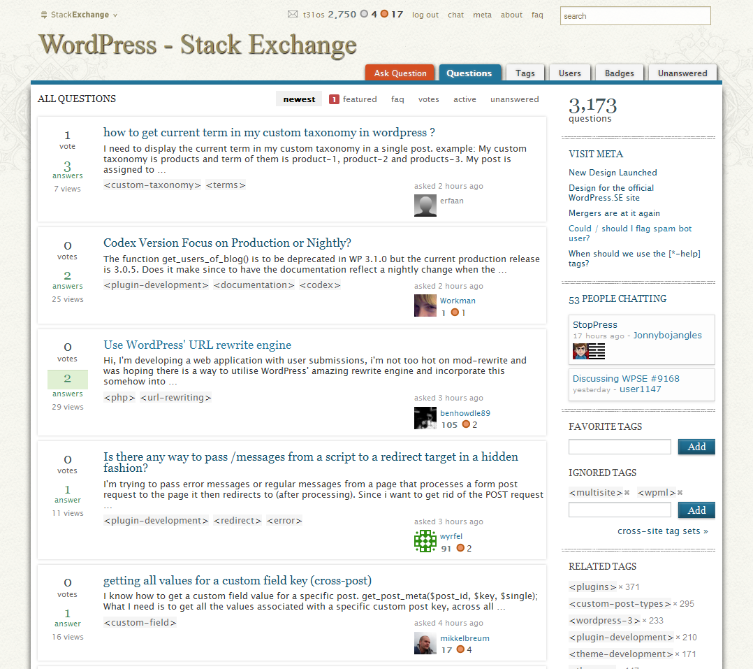
WPSE - the t31os version

Image was posted purely to show how different my preferences are to that of yourself of others, there may of course be elements of my styling that neither of you like, but that's what is great about having Stylish installed(i can have the look i want without having to impose it on everyone else).

Not sure if anything in my posting was inappropriate, so feel free to give me a virtual slap if necessary. :)

Again, just want to say, great work thus far Jin!.. :)

UPDATE:
I havn't seen an objections raised with regard to my comments in this answer so i'm posting a list of links to pastebins with a copy of the style i run, simply for anyone who wants to use it or adapt it to suit there tastes.

Original (from screenshot)
http://pastebin.com/1bxHUECV

Current (what i'm using)
http://pastebin.com/MQ9TJUyT

9
  • I don't want to offend the op but I would way prefer this, I would like to see it with sans-serifs and maybe a slight emphasis on the question titles. It still has a "letterpress" feel but has a UI that is easier to navigate and read.
    – Wyck
    Commented Feb 15, 2011 at 23:02
  • You can have it, assuming you have Firefox and Stylish(or any browser that allows per site CSS styling, Opera would be one). Let me know if you use either and i'll provide the appropriate CSS.
    – t31os
    Commented Feb 15, 2011 at 23:17
  • Yes I would use it, chrome has a version of stylish as well, thanks.
    – Wyck
    Commented Feb 16, 2011 at 2:31
  • Not sure how styles work in chrome, but if i assume it's exactly the same as in Firefox then all you need is: wpse.pastebin.com/1bxHUECV :) (if not the same, you'll have to figure out how to convert it for chrome, i don't use it).
    – t31os
    Commented Feb 16, 2011 at 11:18
  • Yes it works fine in Chrome using the "Stylish" extension.
    – Wyck
    Commented Feb 16, 2011 at 17:48
  • I forgot to add that I changed it a bit ( got rid of serif, added some weight and reduced some sizing). Here is a shot min.us/mbiJAHpNY7VuUJ. Thanks a lot t31os!
    – Wyck
    Commented Feb 16, 2011 at 17:55
  • That's what Stylish is all about, creating your own style. The style will inevitably change over time as i'm sure yours will to, you basically got my first draft, but you're welcome all the same.. :) I couldn't live without stylish...(Thank you Jason Barnabe!)..
    – t31os
    Commented Feb 16, 2011 at 18:31
  • 1
    @t31os - FWIW I really like your design; the current WPSE design, not so much.
    – MikeSchinkel Mod
    Commented Feb 26, 2011 at 20:16
  • @MikeSchinkel - Try out the pastebin i've added above... i've been tweaking the style over time... :-D
    – t31os
    Commented Mar 28, 2011 at 22:10
3

It's nice and fresh, but... if I may suggest a few tweaks:

  • The header seems a bit too large. On my 13" screen I get the impression there's loads of white before any useful information shows up.

  • Perhaps related, I'm finding the thread titles harder to read. Maybe try to increase it by 1pt? And the same for vote/answer/view counts to the left.

  • I might get used to the < > for tags, but my initial impression was that it was getting in the way of readability.

  • I'm preferring the (less yellowish) background of the meta site.

Otherwise, very sweet. :-)

2

Really digging it... awesome work!

2

Looks good!

However my concerns are pretty much same as they were:

  • don't like large header logo;
  • "ask question" needs to be emphasized;
  • I was on the fence about < > around tags, but seeing column of that in sidebar I think it's definitely better to lose those;
  • forgot to add - site's thumb (like in SE sites listing) and favicon are kinda weak, favicon gets lost near other (they are usually more prominent) and it is bit hard to distinguish meta and non-meta favicons because they only differ by minor splash of color.

Update

After some time using it - could blue for links be made more prominent? It can be hard to distinguish links in larger spans of text. And visited links are even harder to spot.

1

The design images looked good, the new look is awesome. You got the right mix of colours and imagery - I find the pages very readable.

Good work, keep on designing!

1

I really like the feel.

I really don't know how I feel about the tags using the <>

You're definitely showing your foo with the limited flexibility at hand. Kudos.

1

Beautiful. Beautiful theme.Was pleasantly surprised when I opened the site. Looks absolutely perfect, keeping in line with the theme of WordPress. :)

1

The new design went live as I was commenting on the feedback post.

Looks great! I like the background on the tags, in general it looks awesome now it's been applied to the site.

Thanks!

UPDATE: Since I'm asking the first question on the new design, I have to say I had a hard time finding the "Ask question" link. Not that I didn't find it, just that it took me a couple of seconds to realise where it was.

1

I think you've outdone yourself...This is a perfect design choice. I find myself looking for more questions to answer just so I can stick around and look at it more! It makes me proud to be part of the community. Jin + 10,000points

1
  • Welcome, I hope it keeps you here! :) Commented Feb 20, 2011 at 19:15
1

Well I don't want to be negative but... there are some things I do not like.

This is a nice design, but in my humble opinion is not a great user interface.

  1. Eyeball soup. The font sizing, coloring and serifs overload make your eyes wander all over the question pages. There is no emphasis or structure to guide you from one question to another visually. It also very hard to skim questions. This lack of visual distinction also makes reading meta data difficult. I think serif was a bad decision, I can tell due to the difficulty of skimming question I will spent much less time on this site.

  2. The header is to large, this is a Q&A site , not a blog.

One important reason stackoverflow ( and sites like reddit, craiglist, etc) are very popular, they understand the difference between user interface and design. Remember this is a Q&A site modeled after stackoverflow where the data is the design!

ps. The search is way to small.

1

Is there a reason for the difference in the lettering for 'WordPress' in the title from the lettering on WordPress or their official lettering, I think its bold vs regular but not sure?

enter image description here

0
  • Ad tag & "<>") I still got the problem that they look like they were part of some <code>/<pre> from a comment on the question below.
  • Ad <p>) The line-height could be expanded to 22px, which makes it far more readable
  • Ad <li>) Again line-height could be expanded to 20px, readability again. Same for margin-bottom from 7px to 10px.
  • Ad header img) I wouldn't mind if you make the header img less in height. Bringing the logo to the left and the nav to the right would make imo sense. I see it close to an app and not a h/p. People are used to it after some visits and won't need it anymore.

I still wonder why you aren't using em for vertical rhytm, but that's another issue.

0

Looking much better now, more professional !

0

I am the only one who miss the old design. I loved it! And this looks like more of a literature design to me. Kinda killed the ease I used to feel with the blue mockup design. Sigh!

-1

I'd just like to ask if there is a specific reason on why the official WP logo is not included in the new design? It represents WP brand but is nowhere to be found here.. I hope it's not some kind of a licensing reason?

1

You must log in to answer this question.

Not the answer you're looking for? Browse other questions tagged .